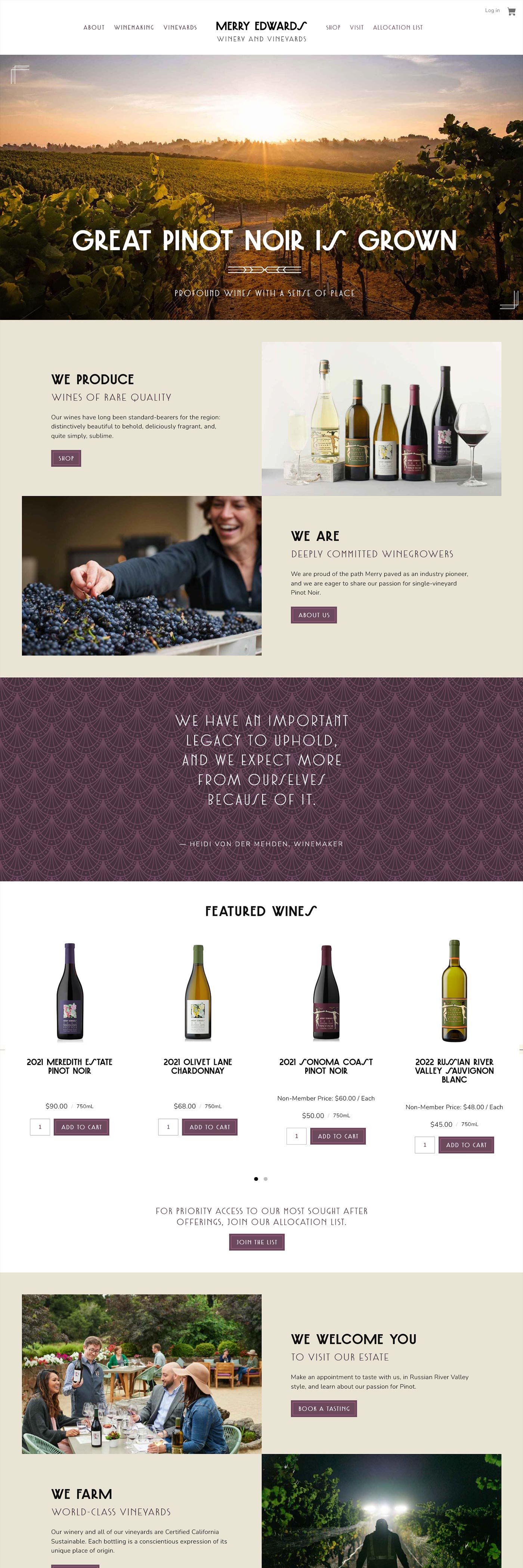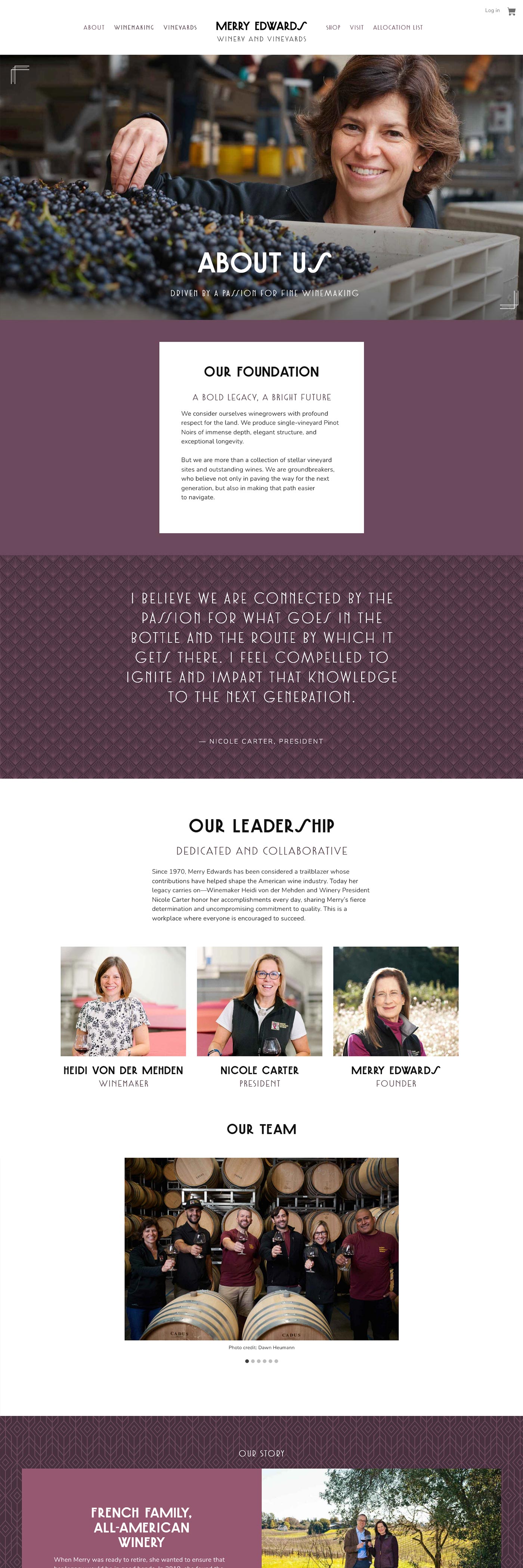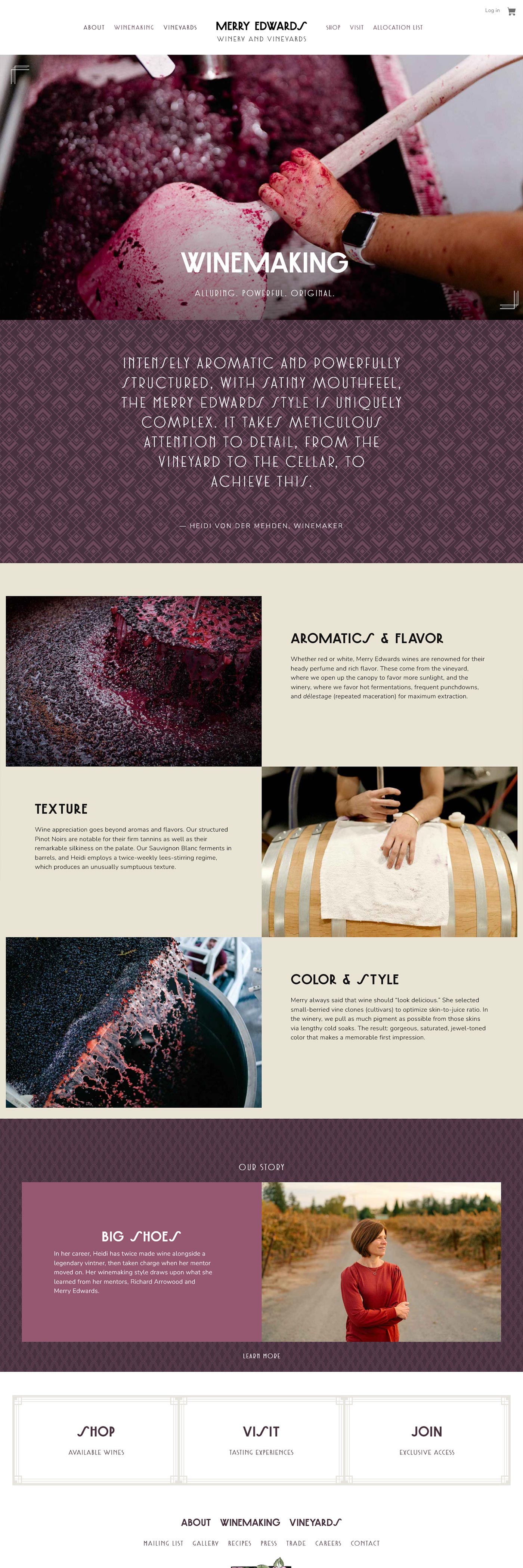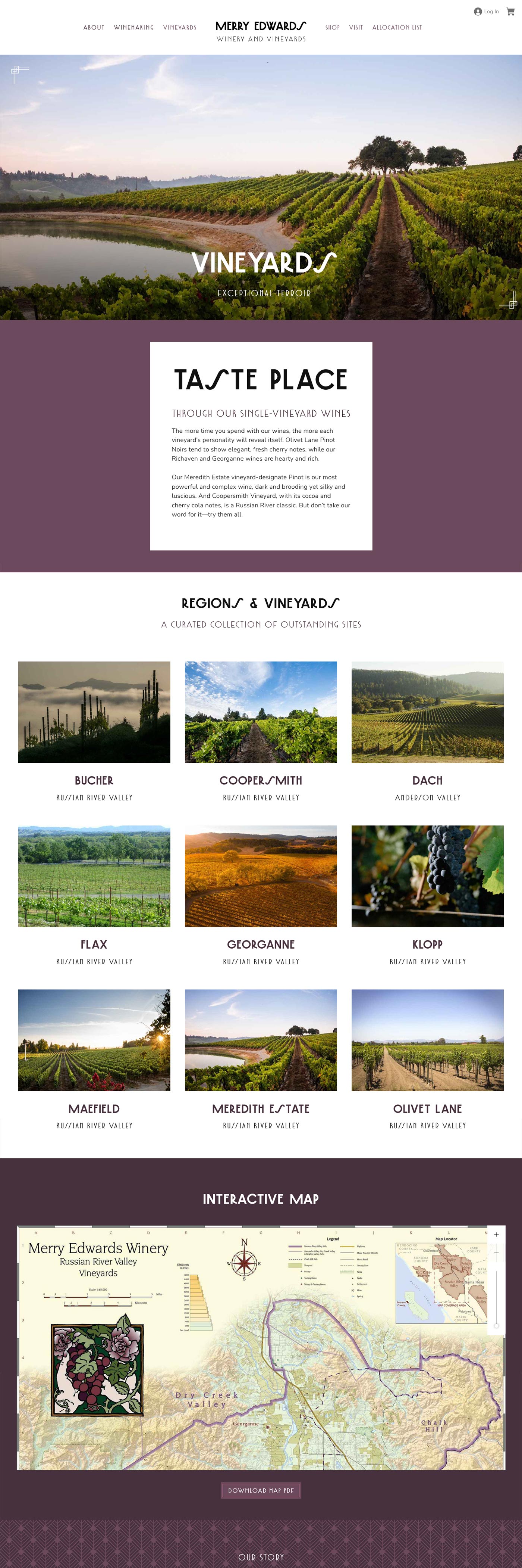
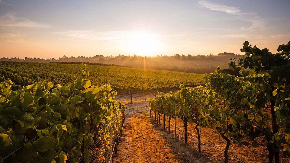
Merry Edwards is a California winemaking icon. Early in her career, she fought for equal opportunities for women at UC Davis, published findings that ended the use of toxic lead foil capsules on wine bottles, and pioneered research into vine clones. Her eponymous winery produces intensely aromatic vineyard-designate Pinot Noirs from sites in the Russian River Valley and Anderson Valley.
When Edwards retired, Maison Louis Roederer acquired the brand, but the leadership remained all-female, with Heidi von der Mehden heading up winemaking and Nicole Carter running business operations. Vin was tasked with re-introducing the brand with a contemporary online presence.
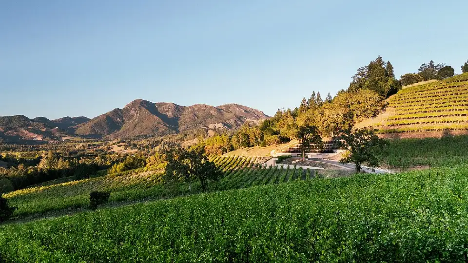
Photo credit: Dawn Heumann.
Under new ownership, Merry Edwards Winery & Vineyards was poised for a brand relaunch that would emphasize the future while honoring the accomplishments of its eponymous founder. In addition, while the winery’s distinctive Sauvignon Blanc has always been a bestseller, the new régime sought to underscore the quality of its terroir-driven Pinot Noirs. Finally, this legendary brand was ready to embrace a partially allocated DTC model.
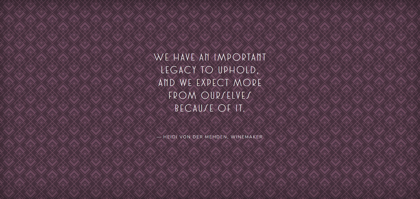
Then there was the matter of winery’s iconic Art Nouveau Revival watercolor labels, by Chez Panisse artist David Lance Goines. A throwback to a time when women earned the right to vote, they had recently been updated with fresh Art Deco-inspired typefaces. Inspired by these cues, we integrated 1920s-style patterns and decorative motifs into a powerfully feminine design.
