An Interview with Creative Director Jon Krauss
Vin Founder and Creative Director Jon Krauss shares about Vin, his story, European studies, typography, brand design, and websites.

How do you pronounce your name?
Yahn... or, if you like, Yawn. I have German and Alsatian ancestors, and my parents were fond of the name "Jan"—they were fans of the football player Jan Stenerud. They decided to Americanize the spelling, so I get called John a lot. I don't mind, it's the same name in translation.
How does Germany fit into your story?
I learned to speak German as a child and always wanted to visit. At Whitman College, I majored in German language and literature and minored in art. During my year abroad, I studied German literature, art history, and architecture at Humboldt University in Berlin.
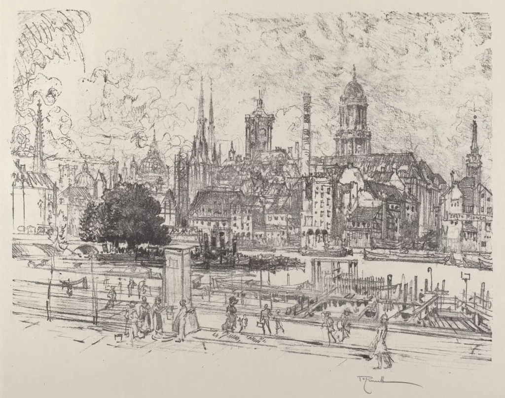
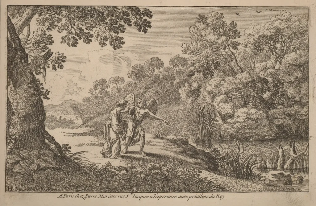
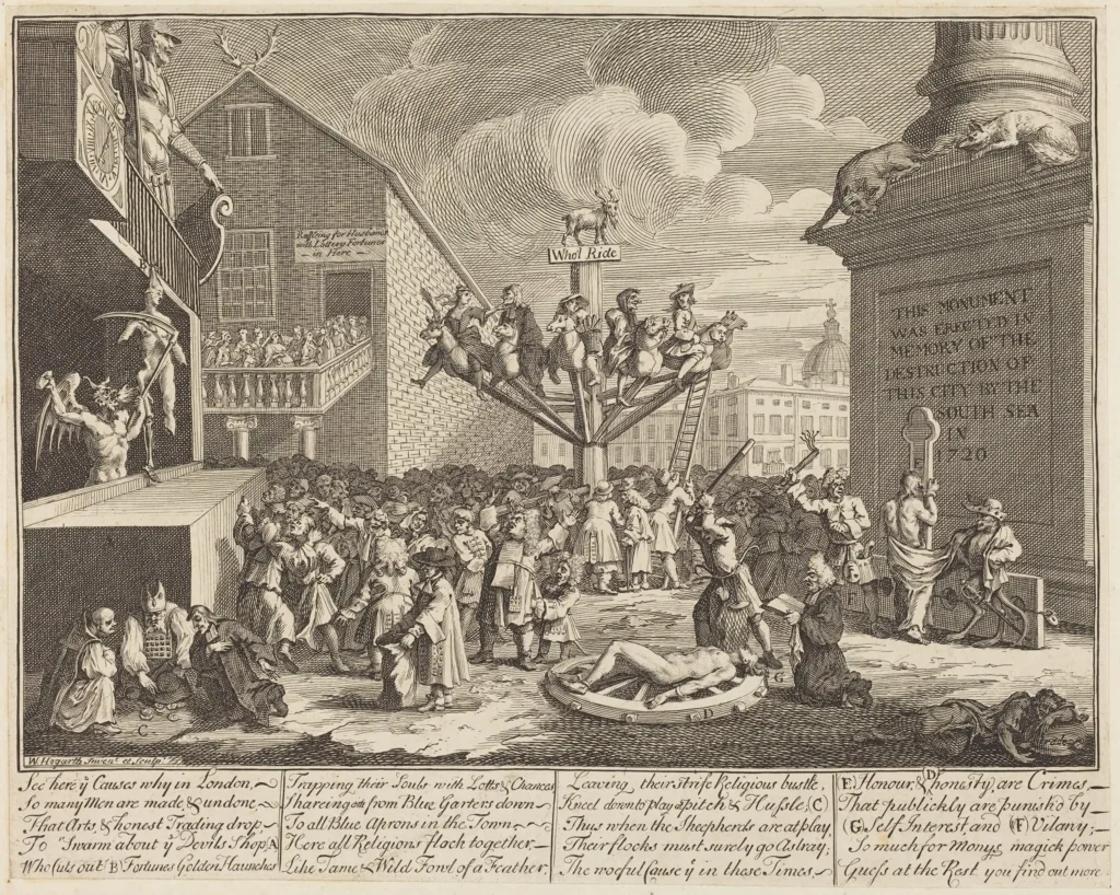
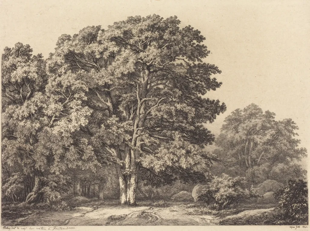
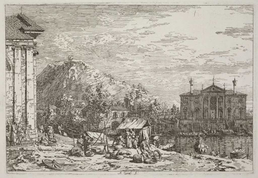
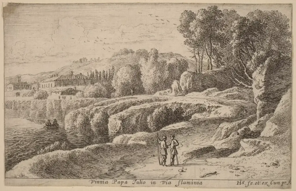
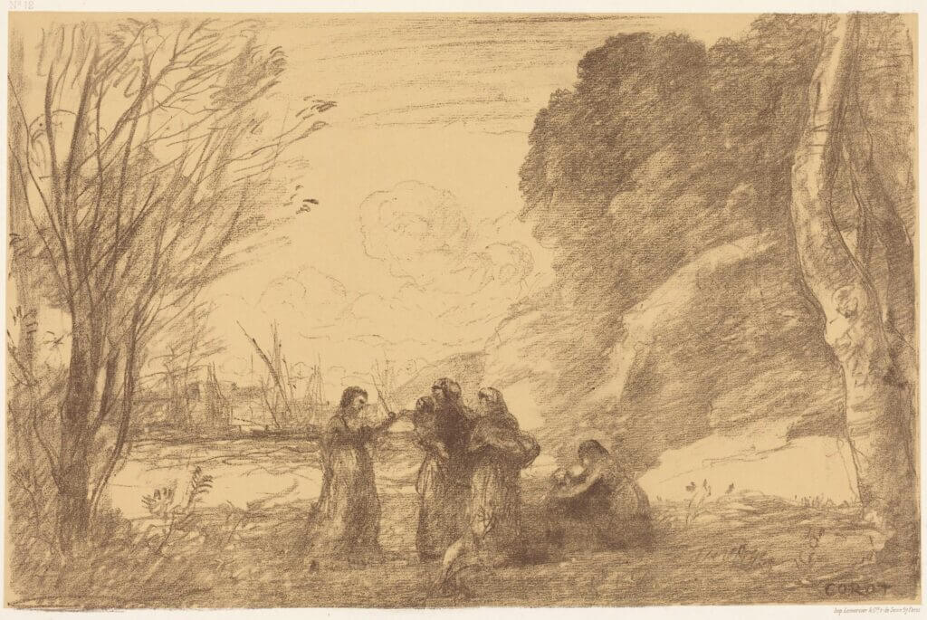
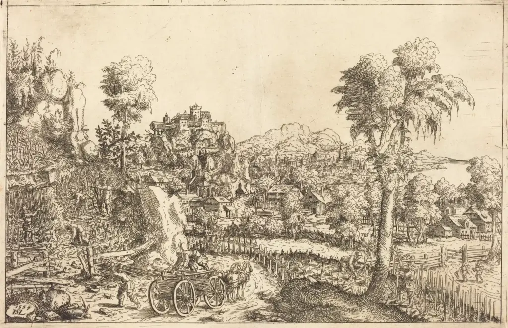
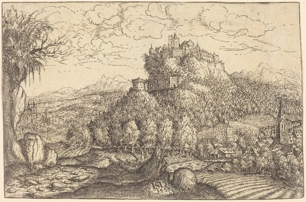
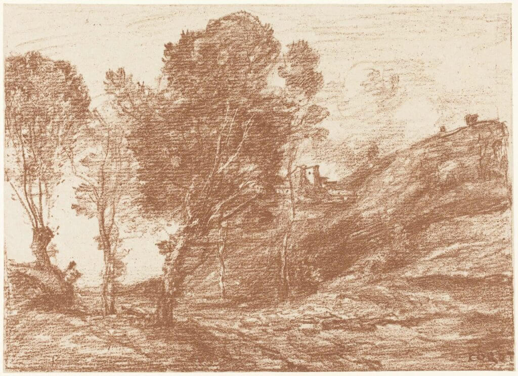
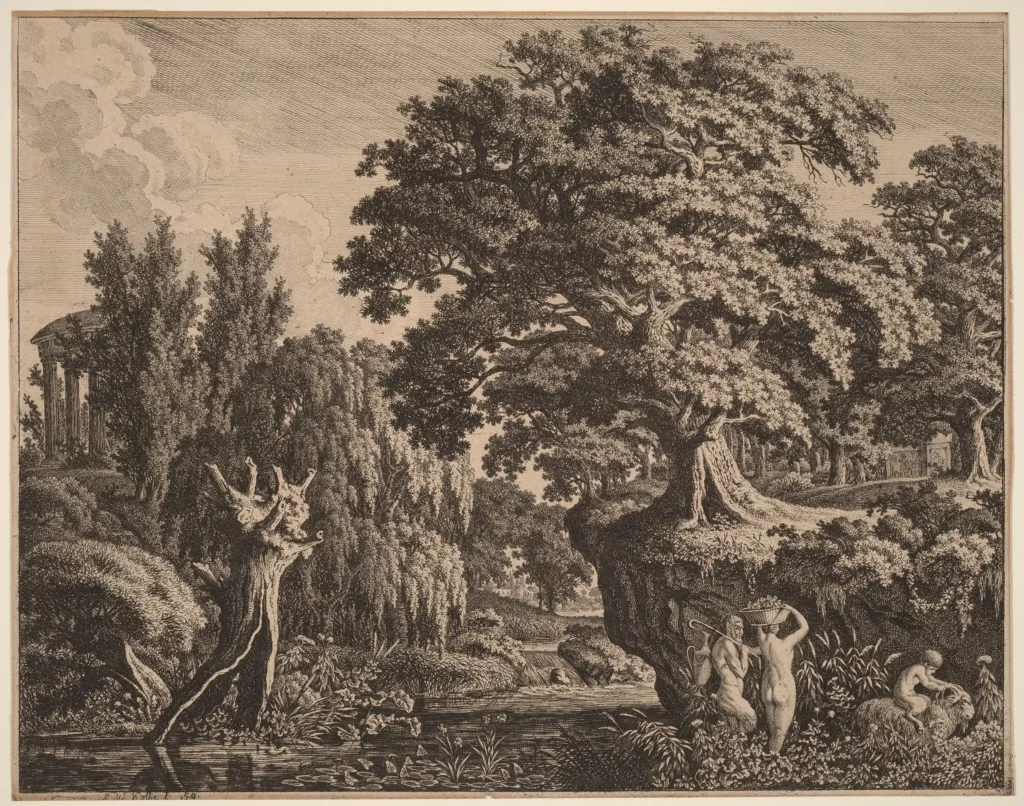
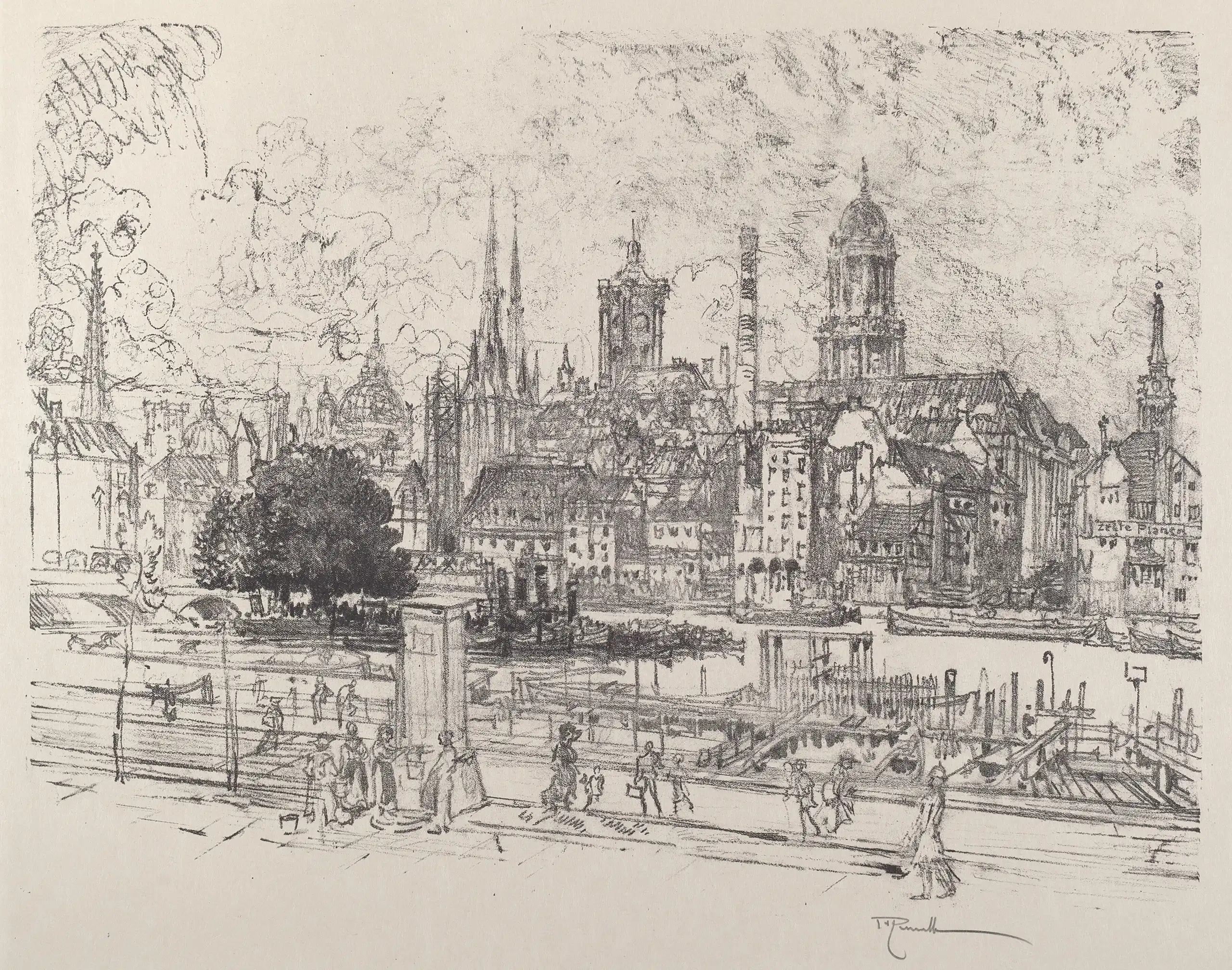
My most memorable class met at the Kupferstichkabinett museum of prints and drawings. We would put on white gloves, and the docent would bring us original illustrations and prints to examine, mostly plein air landscapes.
This was 94-95, shortly after the wall fell, and I was living in East Berlin. It was still a very depressed, gray place, but it was starting to bud new life: There was this palpable energy, and little splashes of color up everywhere. I was inspired by the artwork I was seeing out in the streets, graffiti, and rave flyers. I also had a lot of time on my hands to read, learn, think, and figure out who I wanted to be. That experience in Germany has directed my trajectory in many ways.
Did you enjoy wine when you were living in Europe?
Yes, but to be honest, I was a student, so I drank more beer. I do remember drinking some nice Sturm in Vienna. It's called Federweißer in Germany. It's a fresh, new wine that tastes like carbonated grape juice and is very lightly alcoholic. Easy drinking.
Then what?
After graduation, I went back to school to finish another degree in fine arts—painting, drawing, art history, photography, and installation art—at The Evergreen State College. I spent my early 20s doing what everyone with an art degree does: making art and playing blues-folk-psychedelic music.
At 25, I moved to Portland and started working at a dot-com startup, where I learned web development. On the side, I was designing posters, album covers, and a website for my friends' band for fun. The web spoke to me as a designer. I loved the revolutionary power of self-publishing—the ability to reach people across the world instantaneously—and the openness of the web as a platform. I enjoy "looking under the hood" of a website and figuring out which techniques were used to build it. And I developed an appreciation for the craftsmanship of coding, as well as the discipline and focus to do it well.
That work led to design and development jobs with a couple of tech companies in Seattle, a handful of freelance side gigs, then stints with The Seattle Times and Yale Medical School. I worked with a variety of freelance clients and learned a lot about a range of business sectors—tech, media, publishing, and real estate. But I wasn't personally invested in the design aspect of the work, so I started to look around for an area of focus that fit my personal aesthetic.
How did Vin come to be?
By 2007 I'd found my way back to Portland and was doing freelance design and development. My good friend Brandon Sparks-Gillis, winemaker at Dragonette Cellars, got in touch for help with their logo, packaging, and website designs. A few other winery clients followed, my taste for wine developed, and I realized I was really enjoying working in the wine niche.
So I founded Vin in 2009 as a way to create more opportunities for working with like-minded clients. At first the clean, classic elegance of wine design spoke to me. I appreciated how our audience tends to be sophisticated, and the design approach can be timeless rather than trend-driven. Then, as I got into it more, I enjoyed pushing the boundaries to reflect the broad spectrum of wine styles and personalities out there.
How is winemaking similar to your work?
We think a lot about wine and winemaking at Vin, and I see a number of analogies to my work. The process of developing a personal aesthetic is a lot like the process of developing one's palate: It takes time, practice, exploration, and study. So in the same way you'd expect a winemaker to have refined tastes and a wide body of knowledge and experience, a designer has to as well.
And, strange as it may sound, web development entails craftsmanship. Building a website can be like making a wine: You can follow formulas and use automated tools, but you can get in there and write the code yourself, by hand. That gives you a lot of control over presenting your vision.
I totally get it when I hear a winemaker saying she or he doesn't sleep during crush. I have been known to pull an all-nighter to custom-build a site to my satisfaction. Hand-coding isn't the easy way to work, but it produces the best results.
What makes Vin different from other creative agencies?
First of all, we live and breathe wine. We work with wineries every day. We know what their challenges and goals are. We understand that a winery website's top roles online are storytelling, building club membership, and providing a seamlessly integrated e-commerce experience.
Second, we do the design and coding work ourselves, so implementation and functionality are always top of mind. We often hear from clients who come to us because their past experiences have been frustrating and unfulfilling. Either they have worked with web developers who didn't understand the business of winemaking, or with designers who didn't have the behind-the-scenes technical competency to realize the vision.
Third, we take a brand-centric approach. There is so much competition in the industry that it's essential that a winery website conveys the unique character of the brand through imagery and storytelling. We invite our clients to guide the design process, because we know that each winery has its own distinct brand identity.
We have noticed that you are kind of obsessed with typography...
It's true. It's become a personal interest of mine and one of the main aspects of my design approach. Design is about communication, after all. And on the web we use a lot of text, so the voice it speaks through is important.
My favorite typography book is The Elements of Typographic Style, by Robert Bringhurst—it's fundamental and far-reaching. And I have always been a huge fan of Fabien Baron's work for Harper's Bazaar, Italian Vogue, and Barneys. He understands that typography is 90 percent of design, and that clean, classic typography is an essential element of luxury branding.
I have always sketched logos and wordmarks just for fun, but it wasn't until I started working in design that I decided to study typography formally, at the Pacific Northwest College of Art (PNCA). I loved reading about the typecutters from the Netherlands and post-renaissance Italy and learning about the geometry and architecture of letterforms. The Garamond font, for example, was built on a grid for King François I and represents a transition between classic and more modern forms.
Fonts, to me, are like musical instruments and type hierarchies are like layers in a mix. You stack them up to fill out a piece of music, with the bass instruments on the bottom, and the treble on top. Do you choose an oboe or an electric guitar to play the melody? Do you choose a traditional, contemporary or quirky typeface? The font affects how the content is perceived. And combinations of fonts can create contrasting or complementary tonalities in the design.
What's the state of wine websites?
We've come a long way over the past five years. It's easier than ever to put up a nice-looking website using a publishing platform that allows you to take charge and edit content yourself.
But template websites don't necessarily address the specific needs of wineries. I developed the Vin Website Builder for boutique craft beverage producers—small family wineries producing between a few hundred and a few thousand cases annually—who don't have the budget for a custom-coded site.
Established brands should definitely invest in a custom designed website that's consistent with their visual identity. The website is often the first and main point of contact with customers. So it's important to present an impression of high quality, intuitive usability on the web, in order to create an engaging, positive interaction with visitors. And this is our main focus at Vin.
A final point about websites is the importance of mobile. We're commonly seeing that half or more visitors arrive on mobile devices, whether they're on the road, at a restaurant, or relaxing on the couch. So it's crucial to have a website that functions well on mobile devices. We use responsive development techniques, so our websites work seamlessly across all devices sizes, from mobile to tablet and desktop. This saves the effort and cost of building two separate sites, and makes our websites accessible wherever there's a web connection.
What's your favorite wine?
I love the experience of tasting a wine once I've become invested in my clients' stories. Once I meet the personalities behind a wine brand, I become curious and want to learn more.
But in general? I lean toward Pinot Noir—and rosé or sparkling when it's hot out.
